- Colour Theory
- Design
Grove & Co Colour Focus: Blue
Cool, calm, and restful… there is a myriad of reasons why we love decorating with the colour blue at Grove & Co. Did you know it is a subconsciously calming shade, making you relax without even realizing it, all proven by science! Another reason it is so popular is because blue is the king of versatility. It is a colour that can be introduced into a variety of schemes throughout the house so whether you are using it as a bold statement in your living room or using it to make a soft and soothing space for your bedroom, you can be sure that it will work well.
CHOOSING THE RIGHT SHADE OF BLUE
This can be a challenge however taking a few things into consideration will make the decision a bit easier. Firstly, and most importantly, you need to look at your room’s orientation, and secondly, take into consideration the actual effect and mood you want to create in the space.
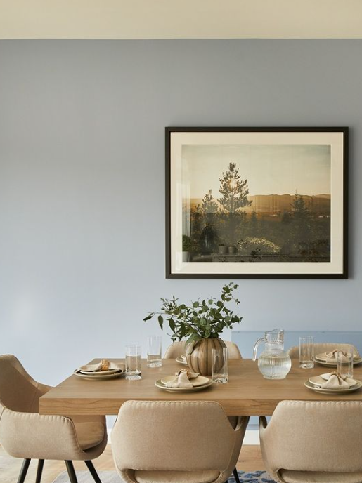
If your room faces north or east, there is a good chance that it will not have a lot of natural daylight so choosing a blue that has warm undertones will work very well. If the room you are decorating faces south or west, it will receive much more warming daylight, so in this case you can look at choosing a cooler tone of blue.
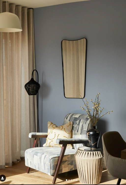
We would always recommend you decide on how you want the space to feel. Is it fresh, warm and cosy or dramatic and luxurious? Blues on the darker side will make the room much more intimate and cosier. They can also offer a real sense of luxury. When we combine blue with warmer and more energetic colours, it inspires confidence and calmness.
LAYERING BLUE
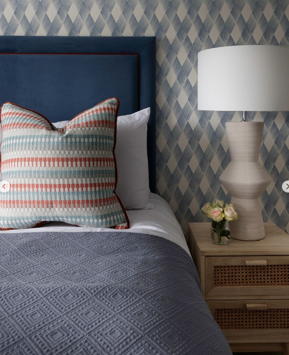
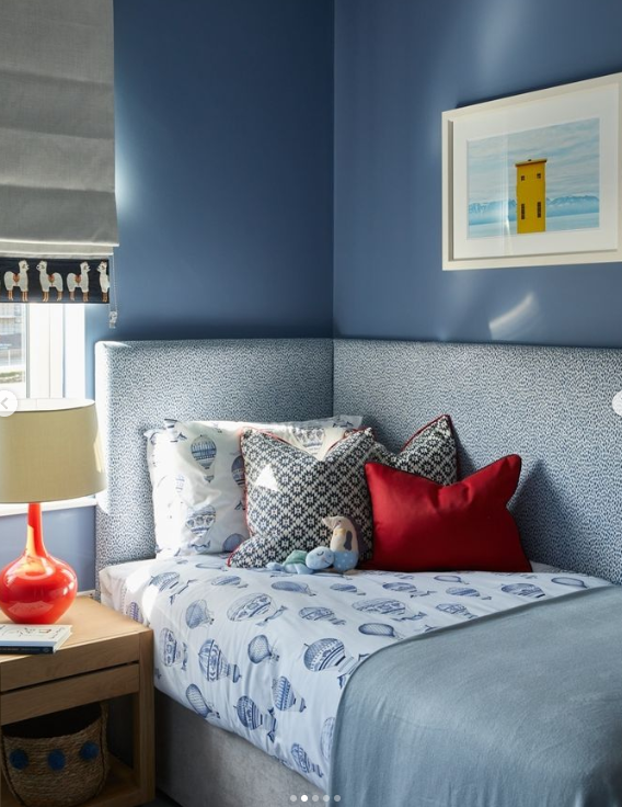
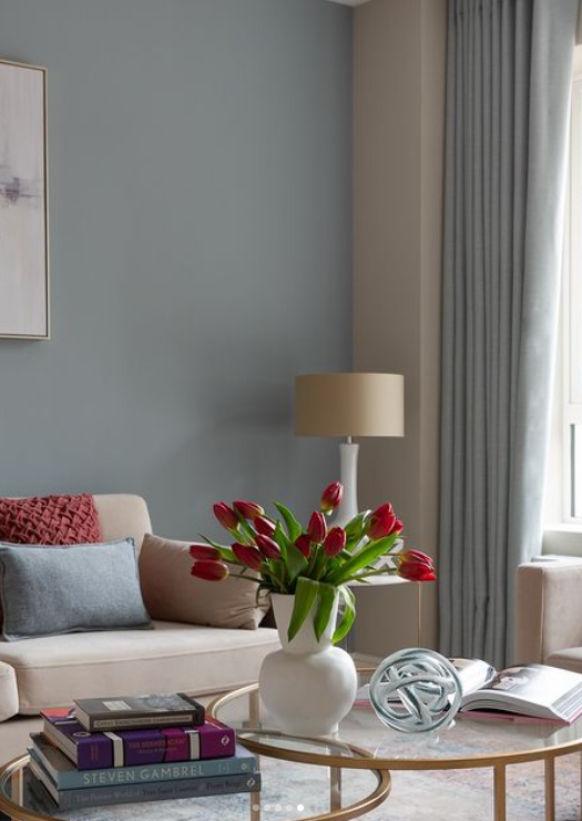
In the world of interior design, we hear the word layering a lot. Layering is about fully understanding a space to add layers and depth to it. We add layering through colours, patterns, textures, styles, and designs. Adding different shades of blue creates a layered and interesting look. Consider pairing a deep navy-blue headboard with a lighter blue paint on the wall in a bedroom scheme. This creates visual interest and depth in your space. When decorating a space with blue, it’s always important to consider the other items in your space, such as your lighting, furniture style, colour and accessories such as cushions, throws and art. Getting the right balance of all of these will make all the difference in creating a connected free flowing space. For example, if you have a navy-blue sofa, you might consider using neutral-coloured accessories and lighting to balance out the look. Another option is to mix and match with accent colours through cushions and art.
WHAT COLOUR GOES WITH BLUE?
Almost all colours go well with blue, and that why it is so popular. Introducing warmer shades, such as yellow, orange and red will add warmth. Don’t forget about the obvious! White is blues best friend. You can always put blue with white – doing so will create an elegant, restful look. At Grove & Co we love it in living rooms and hallways. Another colour to put with blue is one from the range of neutrals and naturals – including brown and black. This could be through your furniture and accessories. One thing we would advise is to remember is to be careful of grey as the wrong tone will make it feel cold.
So, if using blue be confident! Don’t be afraid to experiment. Blue is nature’s most impressive colour. It is because of this that blue never goes out of style and continues to inspire designers in creating amazing spaces. Finally remember what ever blue you choose it will work perfectly with most other colours, making it the perfect choice for every home.